(Click for larger image)
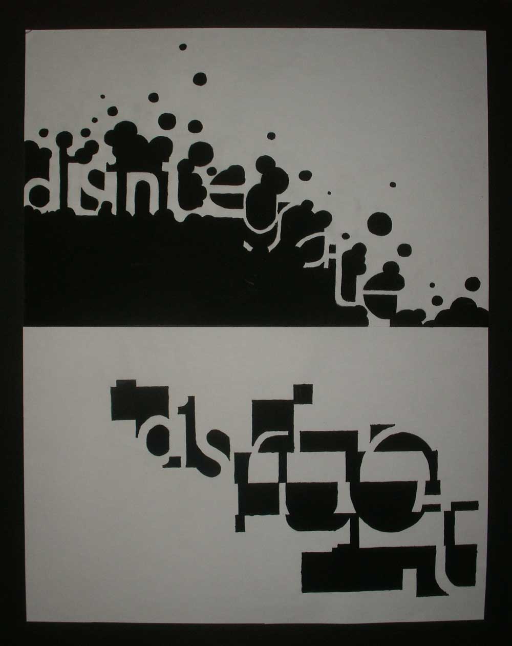
Based on research previously done up on Neville Brody, I can clearly see that he tends to play with negative and positive spaces of letter forms and also try to infuse image with text to create an all new composition. Apart from that, he ventured further more into experimental typography and created pieces of typographic work that didnt look upon typography as just text. His work brought emotions and meaning to the typeface, bringing out the feeling he's trying to portray with purely just text. With this, I started to think of a possible theme I could work on. Initially, it was fashion. But after much consideration, I decided to do a series of design using typography that can bring out the feeling of it with playful positioning. I settled on 2 words: DISINTEGRATE and DISRUPT, both starting with DIS so as to create more link between them.
With my theme set, I decided on my colour scheme of Black and White. This is an opposition to Neville's use of colours often in his designs. Instead of totally creating a design that shows him, I decided to make use of this colour scheme to tell others what his designs is lacking.
On to my designs, both made use of the negative/positive spaces of letterforms to bring out their feelings respectively. For disintegrate, I fused circular blobs with the negative space of the text and created a look as if the word is disintegrating into thin air. For disrupt, i literally disrupted the negative spaces of each letter forms and make them harder to read. After all, experimental typography isnt about legibility, therefore I took the step to come out of my comfort zone and risk. The reason for using more angular rectangles in DISRUPT is so as to bring out the feeling of bandings, which can be seen as waves(e.g sound waves etc.)