thE image.object was part of a school assignment that we were assigned to do. a david carson inspired work of sorts. we were asked to do research on a selected graphic designer or typography and i, apparently chose carson.
since it was the first time i was exposed to the works of carson. i was quite unsure of what to do. especially since the most obvious thing to do would be to emulate his unique 'grunge' style.
it was, unfortunately, difficult for me to identify with it and thus attempt to create an image inspired by his unique style at the start.
since carson dealt with experimental typography, i thought i would get my hands dirty in that too. trying to mess around with words, letters and various fonts. having constantly looked back at his to try and myself 'inspired' i thought i might follow the same direction as some of his works. using images, the play of different fonts and styles to bring certain expressional value and visual meaning.
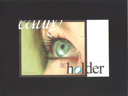
with that in mind i thought i would work on the phrase 'beauty is in the eye of the beholder'. having chose the 'eye' as the focus of the topic i managed to find an interesting closeup image of an eye. it would fit nicely into the composition, using it to grab the attention of users.
as it were, placing the words would be a slight challenge to create a visual hierarchy. the word beauty in scripted font would be at the top left, cropped, giving the effect of the 'eye' looking at beauty. a play of font style, size, position and rotational placement were done with the other words in the phrase in an attempt to create a visually enticing flow of hierachical information.
a white bar was also used to break any symmetry, albiet conservatively.